Css基本使用
Css技巧—-1
默认下body标签会自带8px的外边距,如果想取消可以设置body的css样式
1 | |
位置position
2
3
4
5
6
7
8
9static:该关键字指定元素使用正常的布局行为,即元素在文档常规流中当前的布局位置。此时 top, right, bottom, left 和 z-index 属性无效。
relative:该关键字下,元素先放置在未添加定位时的位置,再在不改变页面布局的前提下调整元素位置(因此会在此元素未添加定位时所在位置留下空白)。top, right, bottom, left等调整元素相对于初始位置的偏移量。
absolute:元素会被移出正常文档流,并不为元素预留空间,通过指定元素相对于最近的非 static 定位祖先元素的偏移,来确定元素位置。绝对定位的元素可以设置外边距(margins),且不会与其他边距合并。
fixed:元素会被移出正常文档流,并不为元素预留空间,而是通过指定元素相对于屏幕视口(viewport)的位置来指定元素位置。元素的位置在屏幕滚动时不会改变。
sticky:元素根据正常文档流进行定位,然后相对它的最近滚动祖先(nearest scrolling ancestor)和 containing block (最近块级祖先 nearest block-level ancestor),包括table-related元素,基于top, right, bottom, 和 left的值进行偏移。偏移值不会影响任何其他元素的位置。代码html
2
3
4
5
6
7
8
9
10
11
12
13
14
15
16
17
18
19
20
21
22
23
24
25<body>
<div class="div_outer">
<div class="div_inner">0</div>
<div class="div_inner_2">2</div>
<div class="div_inner_3">3</div>
<div class="div_inner_4">
4<br>元素的位置在屏幕滚动时不会改变
</div>
<div class="div_inner_5">
5<br>会将移动下来的4给覆盖掉
</div>
<div class="div_inner_6">
6<br>该div相对于body滚动进行top: 10px,left: 200px移动
</div>
<div class="div_inner_7">7</div>
<div class="div_f_1">1</div>
<div class="div_f_1">2</div>
<div class="div_f_1">3</div>
<div class="div_f_1">4</div>
<div class="div_f_1">5</div>
<div class="div_f_1">6</div>
<div class="div_f_2">7</div>
</div>
</body>代码css
2
3
4
5
6
7
8
9
10
11
12
13
14
15
16
17
18
19
20
21
22
23
24
25
26
27
28
29
30
31
32
33
34
35
36
37
38
39
40
41
42
43
44
45
46
47
48
49
50
51
52
53
54
55
56
57
58
59
60
61
62
63
64
65
66
67
68
69
70
71
72
73
74
75
76
77
78
79
80
81
82
83
84
85
86
87
88
89
90
91
92
93
94
95
96
97
98
99
100
101
102
103
104
105
106
107
108
109
110
111
112
113
114
115
116.div_outer{
width: 500px;
height: 2000px;
background-color: antiquewhite;
padding: 10px;
box-sizing: border-box;
margin: 100px;
/*当div需要用边框或者设置内边距时
加上可以保证div的宽高保持不变,而是压缩内部区域*/
}
/*再父元素的前面加上隐藏段
可以阻止子元素边距设置联动父元素*/
.div_outer::before{
content: "";
display: table;
}
.div_inner{
width: 100px;
height: 100px;
background-color: lightgreen;
margin-top: 10px;
margin-bottom: 10px;
box-sizing: border-box;
border: 10px solid black;
}
.div_inner_2{
width: 100px;
height: 100px;
background-color: lightcoral;
margin-top: 15px;
position: relative; /*原始位置保持*/
left: 40px;
top: -40px;
}
.div_inner_3{
width: 100px;
height: 100px;
background-color: lightcoral;
margin-top: 15px;
/*从父往祖找第一个position不是static(默认)的元素
作为定位的相对参照物*/
/*absolute会将该div踢出文档流,即不保存div的原始位置
之前原始位置占据的空间会被后面的元素填充*/
position: absolute;
top: 0px;
left: 0px;
}
.div_inner_4{
width: 100px;
height: 100px;
background-color: lightskyblue;
margin-top: 15px;
/*与absolute相同
从父往祖找第一个position不是static(默认)的元素
作为定位的相对参照物*/
/*fixed会将该div踢出文档流,即不保存div的原始位置
之前原始位置占据的空间会被后面的元素填充*/
/*元素的位置在屏幕滚动时不会改变。*/
position: fixed;
top: 0px;
}
.div_inner_5{
width: 100px;
height: 100px;
background-color: brown;
color: aliceblue;
margin-top: 15px;
/*元素根据正常文档流进行定位*/
position: sticky;
}
.div_inner_6{
width: 200px;
height: 70px;
background-color: lime;
margin-top: 15px;
font-size: 15px;
/*元素根据正常文档流进行定位*/
/*相对它的最近滚动祖先
和最近块级祖先,包括table-related元素,
基于top,right,bottom,和left的值进行偏移。
偏移值不会影响任何其他元素的位置。*/
position: sticky;
left: 200px;
top: 10px;
}
.div_inner_7{
width: 100px;
height: 100px;
background-color: orangered;
margin-top: 15px;
margin-bottom: 50px;
}
.div_f_1{
width: 50px;
height: 50px;
background-color: peru;
margin-top: 10px;
float: left; /*导致div_f_1移除文档流*/
}
.div_f_2{
width: 200px;
height: 200px;
background-color: cyan;
clear: left; /*清除前一个块div_f_1左浮动造成的影响*/
}结果展示
伪类选择器
伪类用于定义元素的特殊状态。
链接伪类选择器:
2
3
4
5:link:链接访问前的样式
:visited:链接访问后的样式
:hover:鼠标悬停时的样式
:active:鼠标点击后长按时的样式
:focus:聚焦后的样式
位置伪类选择器:
:nth-child(n):选择是其父标签第n个子元素的所有元素。
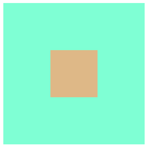
常见元素居中方法:
1.使用绝对定位实现(设置position)
2.利用弹性盒子实现
html代码:
2
3
4
5<body>
<div class="my_div">
<div class="son_div"></div>
</div>
</body>css代码
2
3
4
5
6
7
8
9
10
11
12
13
14
15.my_div{
width: 300px;
height: 300px;
background-color: aquamarine;
display: flex;
justify-content: center; /* 子元素水平居中 */
align-items: center; /* 子元素垂直居中 */
}
.son_div{
width: 100px;
height: 100px;
background-color: burlywood;
float: inline-end;
}
flex-direction 属性指定了内部元素是如何在 flex 容器中布局的,定义了主轴的方向(正方向或反方向)。
取值:
row:flex容器的主轴被定义为与文本方向相同。 主轴起点和主轴终点与内容方向相同。
row-reverse:表现和row相同,但是置换了主轴起点和主轴终点。
column:flex容器的主轴和块轴相同。主轴起点与主轴终点和书写模式的前后点相同
column-reverse:表现和column相同,但是置换了主轴起点和主轴终点
响应式布局(用到了再搜)
media查询
当屏幕宽度满足特定条件时应用css。
2
3
4
5
6@media(min-width: 768px) {
.container {
width: 960px;
background-color: lightblue;
}
}
本博客所有文章除特别声明外,转载请注明出处!